Are we there yet? The road ahead.
Week beginning June 3, 2013
June has arrived ... when we find out if the "sell in May" mantra will prove to be profitable this year.

Copyright: Randall Ashbourne - 2011-2013
We will spend this weekend examining those omens because in the years it is accurate, the Bradley Model is uncannily so.
Last weekend I indicated I thought stock markets had entered a correction mode likely to last for at least several weeks - and used a weekly chart of the ASX200 as an example of what we could probably expect.
In this I am at odds with the Bradley forecast - and those who now worry that we have entered crash mode.
I won't go into the astrological weather. I've done that in the past few weeks and the Bradley itself takes its trend change dates from particular combinations of planetary pairs. In short, the Bradley is distilled astrology.
The most significant dates for June are likely to be the 7th and the 22nd.
And June also brings what is probably the most important Bradley Model trend change date for the year.
If the Bradley is correct, this trend change will be long-lasting, because the next really major date does not arrive until March, 2014.
If the Bradley is correct, this trend change will be long-lasting, because the next really major date does not arrive until March, 2014.


Safe trading - RA
(Disclaimer: This article is not advice or a recommendation to trade stocks; it is merely educational material.)
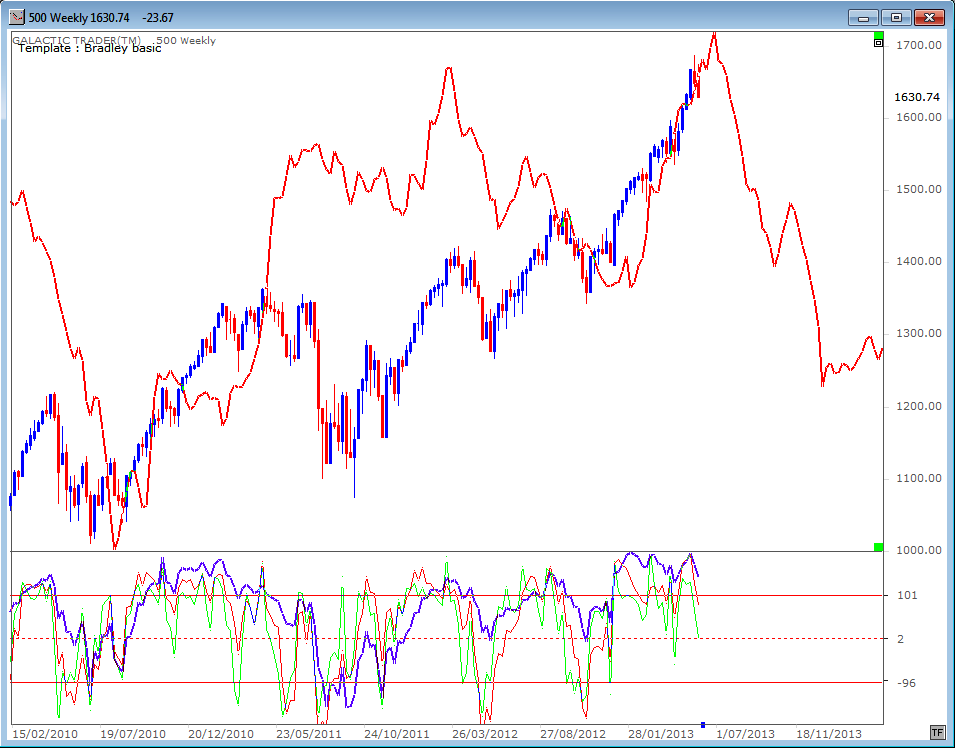
For this edition, we'll be concentrating on Pollyanna, Wall Street's SP500, and using it as the barometer for most major stock indices.
And our first chart will be the Bradley Model. Pollyanna has been rising since the Bradley indicated a long-term trend change in mid-2010 and certainly seems to have been "following" the model fairly accurately since its direction change late last year.
If it works again, the trend will change this month - and continue in that direction for many months.
Next we will look at a "tweaking" of the basic Bradley. It's important to remember with both that it is the dates which are most important - rather than the direction or the amplitude of the swing. Nonetheless, both versions indicate a big change is about to arrive.
Forecast 2013 is now available for sale and download.
Click the button on the right for more details.
Click the button on the right for more details.


Forecast 2013 is now available for sale and download.
Click the button on the right for more details.
Click the button on the right for more details.
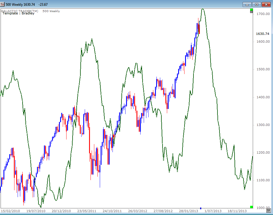
Next we'll have a look at the long-range performance of the tweaked version, using a multi-decade chart for Pollyanna, with the index in blue and the Bradley in dark green.
If you spend a few minutes closely examining this chart, you'll understand what I mean when I say it's the dates that are important, rather than the direction or size of the swing.
Sometimes the index made a low while the Bradley line was making a peak - and at others they matched each other closely. Even so, we can see the potential for a major downturn about to start if it's not already underway.
Okay. So why am I at odds with the Bradley forecast and why am I not convinced that we have reached THE top of this Bull run?
Because it wouldn't be "normal". And it's true these markets aren't normal. They're hitting these levels because central banks like the US Federal Reserve have been printing money by the *ahem* helicopter load and dropping it into asset purchases to prop up stock markets.
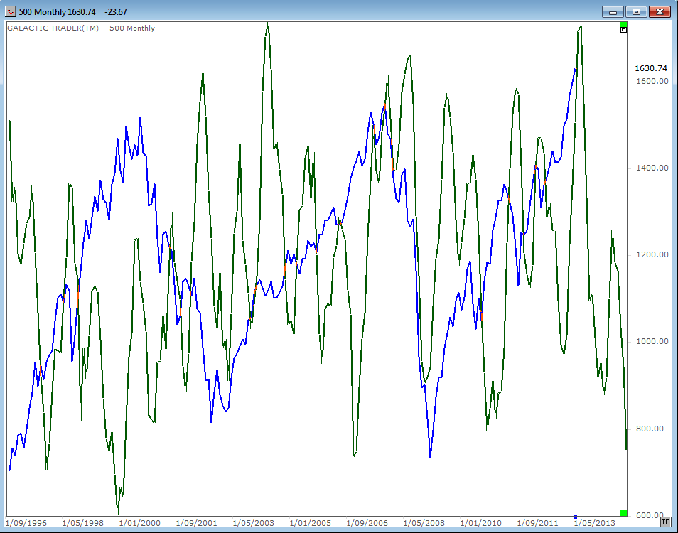
Nevertheless, it is "normal" for markets to undergo a topping PROCESS. It takes Time. We now have what MIGHT be the first sign that The Top is in the process of being put in place.
We now have a monthly bar that has been left hanging by a thread - rather similar to the two earlier Bull peaks. BUT there is no near-term negative divergence obvious in the long-range Canary and there is no multi-month process evident as it was at the previous tops.
Because it wouldn't be "normal". And it's true these markets aren't normal. They're hitting these levels because central banks like the US Federal Reserve have been printing money by the *ahem* helicopter load and dropping it into asset purchases to prop up stock markets.
Nevertheless, it is "normal" for markets to undergo a topping PROCESS. It takes Time. We now have what MIGHT be the first sign that The Top is in the process of being put in place.
We now have a monthly bar that has been left hanging by a thread - rather similar to the two earlier Bull peaks. BUT there is no near-term negative divergence obvious in the long-range Canary and there is no multi-month process evident as it was at the previous tops.
So, on the basis of the technical evidence ... and merely what is "normal" behaviour ... I find it hard to believe we are launching into crash mode from here. I do think we have entered a significant correction mode, but cannot rule out an attempt to record new highs.
However, the very long-term omens are quite dire.
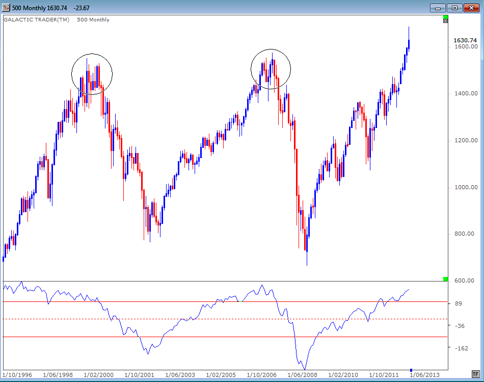
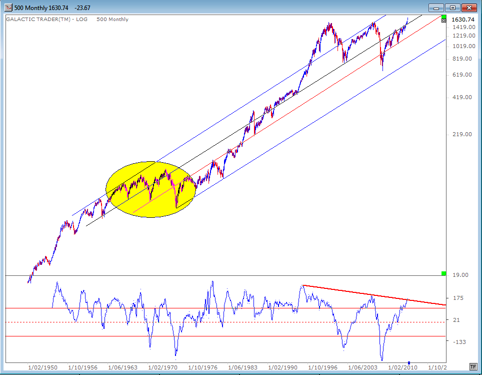
Which is the subject of our next chart. I have indicated before, simply through an "eyeball" look at the chart, that stock index behaviour since 1999/2000 bears a remarkable similarity to what happened during the 1960s when there was a succession of Bull peaks and Bear bottoms (the area marked with a yellow oval).
If that is so, we are now rapidly approaching Peak 3 ... the start of the deepest Bear plunge.
And on this chart the long-range Canary is screeching a warning sign that the Gates of Hell are starting to open ...
However, the very long-term omens are quite dire.
Which is the subject of our next chart. I have indicated before, simply through an "eyeball" look at the chart, that stock index behaviour since 1999/2000 bears a remarkable similarity to what happened during the 1960s when there was a succession of Bull peaks and Bear bottoms (the area marked with a yellow oval).
If that is so, we are now rapidly approaching Peak 3 ... the start of the deepest Bear plunge.
And on this chart the long-range Canary is screeching a warning sign that the Gates of Hell are starting to open ...