

Copyright: Randall Ashbourne - 2011

I told you so
and some spooky stuff
Week beginning July 18, 2011
The first four words of the heading are meant to be a joke. Sort of. Stock markets worldwide took a tumble last week, but it will have come as no surprise to readers of last weeks report
even if everyone else is convinced it was all the fault of Cantor, Obama, Moodys, S&P and whether or not the USA should borrow some more trillions so Ben Bernanke can continue propping up Wall Street.
In large, bold, italic script last week, I said:
So, what we have here are two possibilities - either the index is topping out at a slightly lower high and is about to go into freefall, or the weakness will be only short-lived (maybe down into the Full Moon) before a final exhaustion rally tops out and brings on a very significant decline.
The first part of that forecast has been met - the decline down towards the Full Moon; now we need to divine whether it is short-lived weakness or the start of a freefall.
In a short while, we'll return to the technical charts to try to answer that question, but I want to stress something I emphasise in the book - pay more attention to your charts than to the "news" and, in particular, the myriad opinions about what the "news" means.
Worrying about what the ratings agencies think of the USA debt is a recipe for madness; these are the people who stuck Triple-A ratings on the pile of poop CDOs that caused the 2008-2009 crash and actually caused this mess in the first place.


However, before we go to the charts I intend doing something I won't do very often ... talk about some of the spooky stuff.
Safe trading - RA
(Disclaimer: This article is not advice or a recommendation to trade stocks; it is merely educational material.)
Note: The charts are courtesy of Incredible Charts, whom you can find under the Software button if you're a newbie in need of some really good software at a great price. Free! If all you want is the delayed EOD data.
And not just the Lunar phases, for which we have statistical evidence of an overall tendency for stock markets to rise during the 14-day period between the Full and New Moons.
Those of you who are not interested in astrology can skip over this bit and go straight to the technical stuff.
In astrological terms, we have been anticipating that markets would top out sometime between May and August. Some of that timing has to do with the position of Jupiter changing signs from Aries into early Taurus; some of it has to do with the long-range War of the Gods involving Saturn, Uranus and Pluto; and some of has to do with transits to not just the birth chart of the United States, but also of transits to the chart of the US Federal Reserve.
The Bradley Model, which many stock market traders take some notice of without realising it is astrologically-based, predicts a major turn this year on July 29-30.
It is possible, still, that we can get the final exhaustion blow-off into those dates, or early August. It's not only New Moon time, it also happens to be when Mars changes sign into Cancer, which is where the USA's Sun, Venus and Jupiter all reside. The first aspect Mars makes will be a trine to Neptune, still just within its home sign, Pisces.
However, immediately after that, Neptune will backtrack into the weird world of Aquarius and Mars will start firing up negative energy - a square to Uranus, an opposition to Pluto and a square to Saturn.
Before Mars starts those aspects, we'll also see a sign shift from the Sun and Venus; moving into Leo from where their first moves will be to trine Uranus, which has rulership of stock markets.
In the same period, heliocentric Mercury will be in Sagittarius. In early August, geocentric Mercury will go into one of its retrograde periods and spend most of the month there.
Now, what all this boils down to is - the omens, portents and entrails suggest "now" is not the time for markets to collapse in a huge heap. The energy at play between now and the end of the month tends towards a more optimistic outlook.
But, whichever way it goes, we can anticipate a significant move coming late in July or in early August. Now, none of this has anything at all to do with the material in the book; none of it should really influence our reading of the stock charts; but it's my report and I find it a lot more interesting and informative than anything Nancy Pelosi or Sarah Palin might have to say - about anything.
And now to the charts!
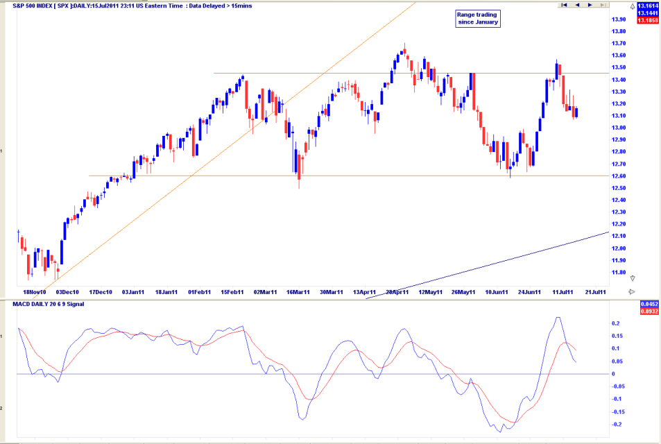
And for our first chart we're going back to the one we dealt with last week and two weeks before that.
Last week, I indicated:
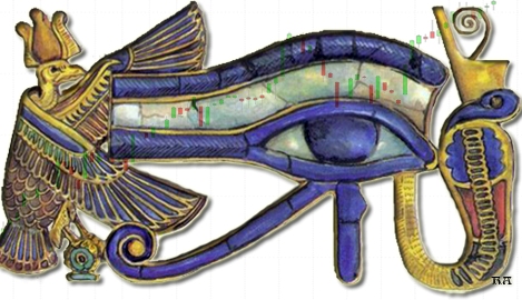
There are reasonably safe levels and timeframes to put Long trades on, as demonstrated by going back to the June 27 Eye of Ra; and there are relatively safe levels to venture into a potential, but protected, Short position, as evidenced by the horizontal lines on that first chart and the timing of the 1Q Moon.
This paragraph was in addition to the one I reiterated at the start of this week's report - last week was a time for being out of Long positions, or in Short positions.
The SP500 has given some indication that it may well be following the Lunar phases outlined in The Moods of The Moon and in the excerpt under the Moon Trading button ... ie: we have a potential two-week Low. The keyword is "potential". There are no guarantees in this business, only likelihoods and probabilities.
Last week, I discussed the potential for a short-lived drop into the Full Moon before the final leg of an exhaustion run which could take the SP500 maybe as high as the early 1400s. That possibility still lives - and is why I outlined the Bradley Model date and the energies symbolised by the approaching astrological transits.
That potential also finds some endorsement from the state of the fast MACD. Yes, it has given a negative cross. But what is interesting is the height of its last peak - higher than the May 2 peak, even though Price itself didn't go that high. It is a form of positive divergence and indicates the possibility of one more Pollyanna push past the orange horizontal barrier and into new Highs.
I'd imagine the "news" will be some softening of hardline positions between the Elephants and the Donkeys and, if it occurs, there will be talking heads talking about the strength of the wonderful new Bull. Bull is right, but it's only half a word.
Last week, I indicated:
There are reasonably safe levels and timeframes to put Long trades on, as demonstrated by going back to the June 27 Eye of Ra; and there are relatively safe levels to venture into a potential, but protected, Short position, as evidenced by the horizontal lines on that first chart and the timing of the 1Q Moon.
This paragraph was in addition to the one I reiterated at the start of this week's report - last week was a time for being out of Long positions, or in Short positions.
The SP500 has given some indication that it may well be following the Lunar phases outlined in The Moods of The Moon and in the excerpt under the Moon Trading button ... ie: we have a potential two-week Low. The keyword is "potential". There are no guarantees in this business, only likelihoods and probabilities.
Last week, I discussed the potential for a short-lived drop into the Full Moon before the final leg of an exhaustion run which could take the SP500 maybe as high as the early 1400s. That possibility still lives - and is why I outlined the Bradley Model date and the energies symbolised by the approaching astrological transits.
That potential also finds some endorsement from the state of the fast MACD. Yes, it has given a negative cross. But what is interesting is the height of its last peak - higher than the May 2 peak, even though Price itself didn't go that high. It is a form of positive divergence and indicates the possibility of one more Pollyanna push past the orange horizontal barrier and into new Highs.
I'd imagine the "news" will be some softening of hardline positions between the Elephants and the Donkeys and, if it occurs, there will be talking heads talking about the strength of the wonderful new Bull. Bull is right, but it's only half a word.
Reality is this. The angle of the current trend is sharper than it has ever been and the long-range MACD is starting to roll over, just as it did during the two previous blow-off peaks.
It is possible the Bull is real - that we are all totally misjudging the economic malaise affecting Europe, the collapse of housing prices and the rising unemployment and falling wages in the USA, and the absurd notion that nations fix their massive debt problems by taking on super-massive debt.
It is possible that Alan Greenspan's two "irrational exuberance" peaks were neither irrational, nor exuberant. After all, Greenspan got almost everything else wrong - and taught Bernanke everything he knew - so, maybe, irrational exuberance is the new normal.
It's just not likely, nor probable. Anyway, these musings are as irrelevant as anything else. We're more interested in the charts - and I indicated last week the SP500 is still in an uptrend. We may not think it's sustainable for much longer, but until it's broke, it ain't broke and there is danger in being Short prematurely.
A lot of people have lost a lot of money during the past two years betting that this index was going into another catastrophic dive to a new bottom. Eventually, they may prove to be correct. And that may now be sooner, rather than later. But, when you look at the profits to be made when it actually starts, rather than the losses which result from being wrong, why give your bank account a case of premature emasculation?
For the moment, we need to allow for the possibility that this market has at least one further rally spike to come. I went into some detail about that last week and highlighted various areas on the black chart used at the end of the report.
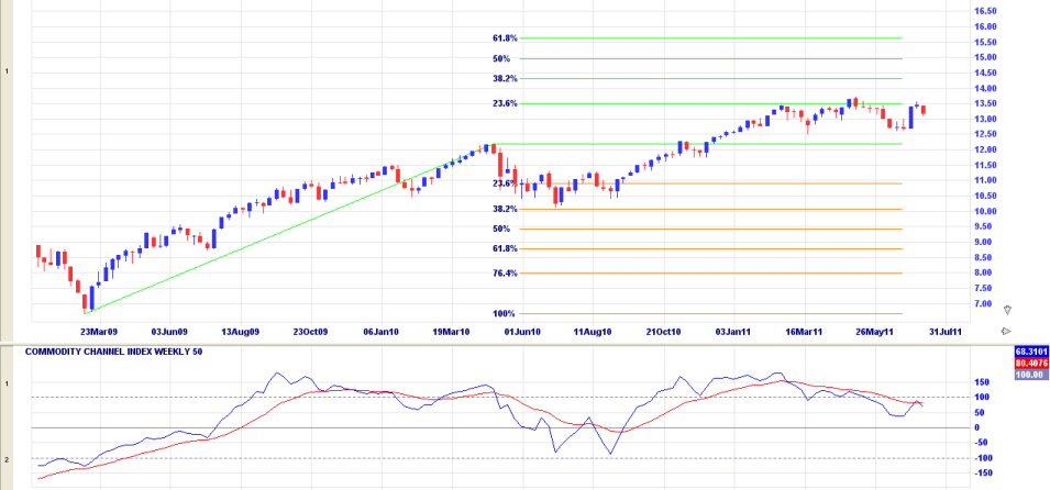
In this chart above, we will use one of the other techniques outlined in The Technical Section of the book - the use of Fibonacci retracements and extensions.
First of all, note the 50 CCI has gone negative. But, also note from the final spurt for the first half of the recovery rally in 2010, that it is possible to recover and make a lower, negative-divergence peak at a higher price. These techniques are also dealt with in depth in the book.
We can see that the major pullback following the first half of the recovery rally hit a 382 Fibonacci level before bouncing into a new uptrend. It is not unusual for an extension to go to a similar level, which puts the potential final leg target at 1431 - which is very similar to the Price level which arrived in other ways last week.
It is currently backing off, for the third time, from the 236 extension level - around 1350. What is NOT yet certain is whether the attempt to break above that level is finished and it's all over, Red Rover - or whether last week was just the normal 1Q-FM weakness.
I thought we might end this session with a little chat about gold.
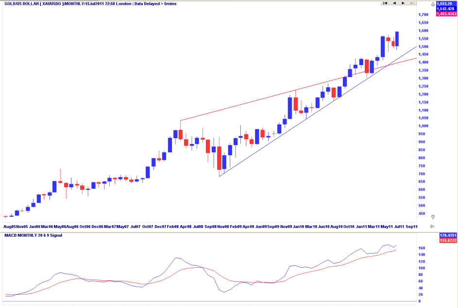
Heliocentric Mercury travelling through the sign of Sagittarius often causes big movements in precious metals and gold-in-greenbacks appears to be on another run north, having decisively broken above overhead Resistance and retesting Support at its uptrend line.
It could be an exhaustion run. In the final chapter of The Idiot & The Moon, I deal with the length of trends and countertrends. Gold is coming up on a potential 180 cycle date towards the end of the month - when there is "timing" for lots of changes.
The possibility of a US debt default and the ongoing problems in Europe have gold bugs convinced the metal is on a run to much higher levels and that is, as everything always is, possible. We don't deal here with possibles; we try to restrict ourselves to "probables" and pay attention to the charts, rather than the chat.
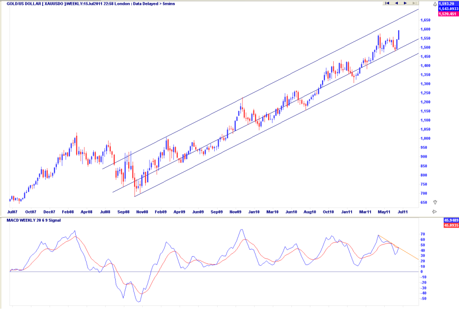
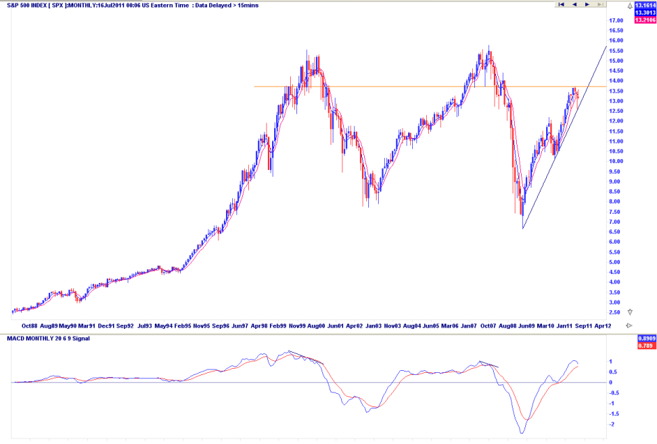
Quite clearly, the monthly chart shows greenback gold in a Bull run and with no divergence from the MACD. The weekly chart shows an intermediate-term uptrend channel ... but with a cautionary note from the MACD.
Nothing to be panicky about at this stage, just a gentle reminder not to nod off. One thing that has to be kept in mind - if stocks go into freefall, gold will not necessarily go in the opposite direction. When big drops start, those on the wrong side of the trade have to sell everything - gold, silver, oil, soybeans, and their mothers - to meet the margin calls.
Nothing to be panicky about at this stage, just a gentle reminder not to nod off. One thing that has to be kept in mind - if stocks go into freefall, gold will not necessarily go in the opposite direction. When big drops start, those on the wrong side of the trade have to sell everything - gold, silver, oil, soybeans, and their mothers - to meet the margin calls.
Copyright: Randall Ashbourne - 2011